I must admit that I am extremely passionate about learning languages and discovering new cultures. One day, I pondered the possibility of creating an all-encompassing system that provided learners with all the resources they needed in one place. The design that emerged from this idea became my college thesis.
Periglot is a comprehensive language learning solution for learners of all levels, packed with tools, resources, and lessons to support their language learning journey. Regardless of your learning style, Periglot has a tailored plan for you.


One of the most important things for me to achieve with this brand was full inclusivity of learning methods. I wanted Periglot to stand out from the competition by fulfilling a need that has been abandoned by the digital age. So we went retro!
I crafted assets that contemporary language learning platforms often overlook, such as textbooks and travel guides. These aids serve to assist users in navigating foreign countries, especially in areas where internet connectivity might not be readily available for translation assistance.
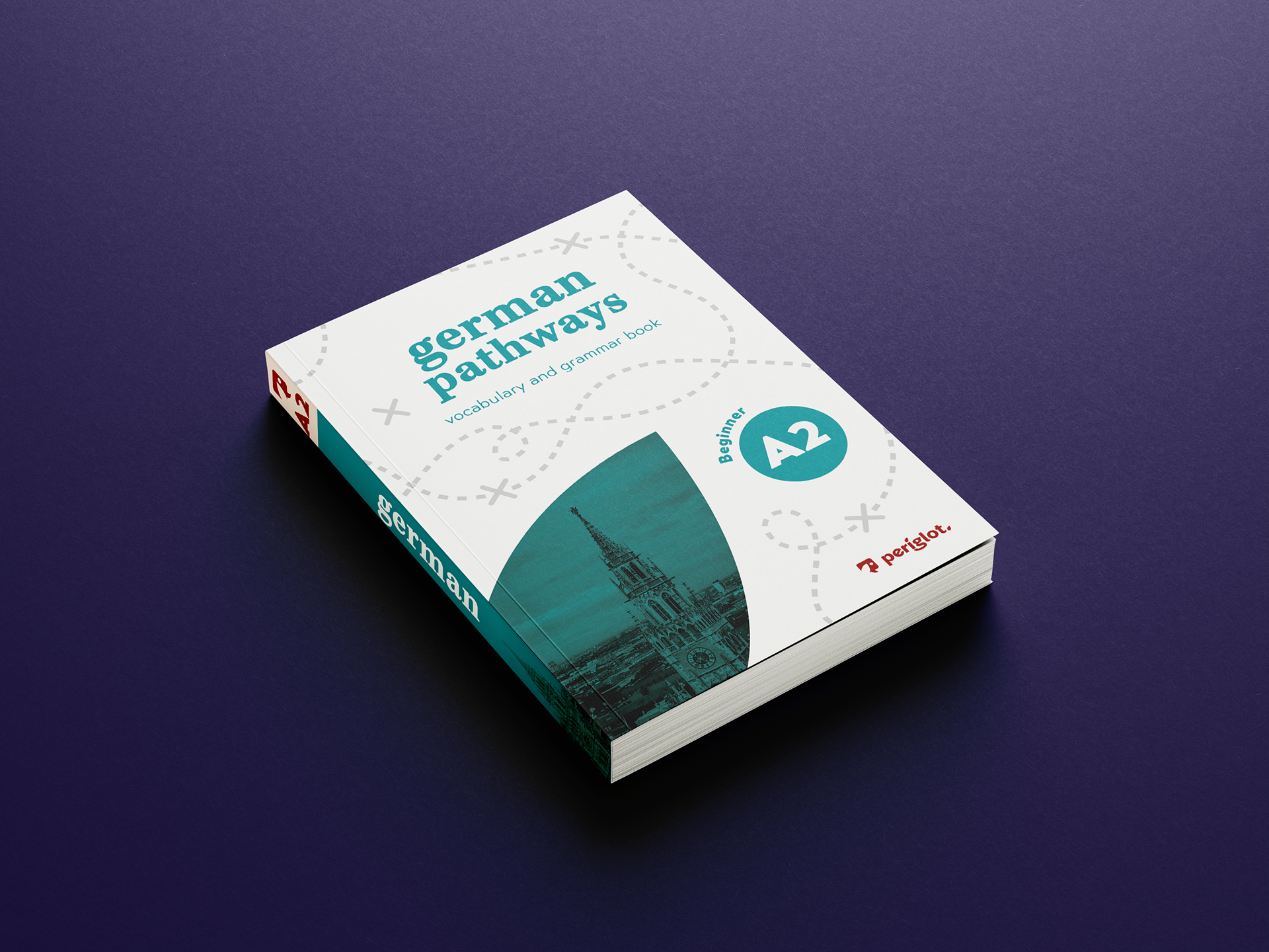
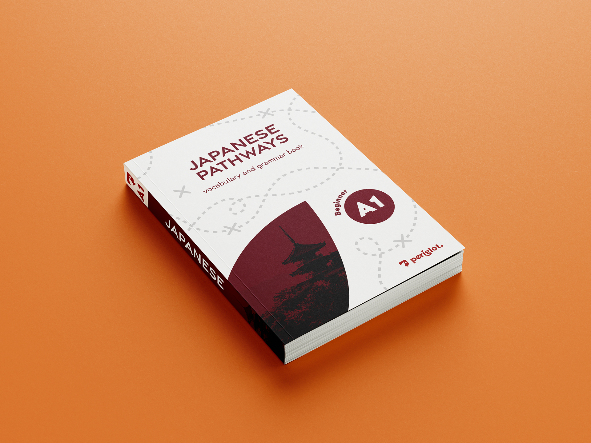
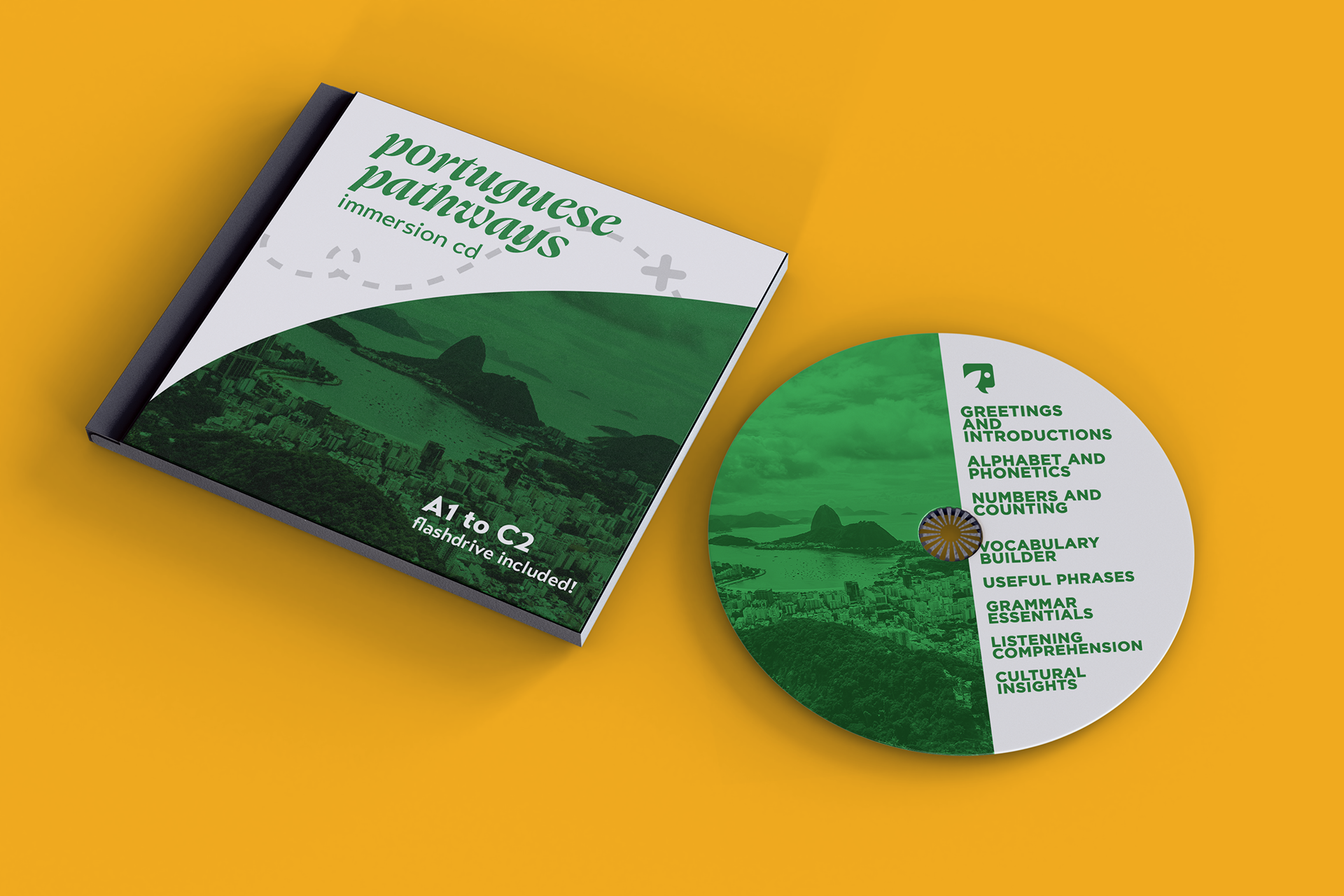
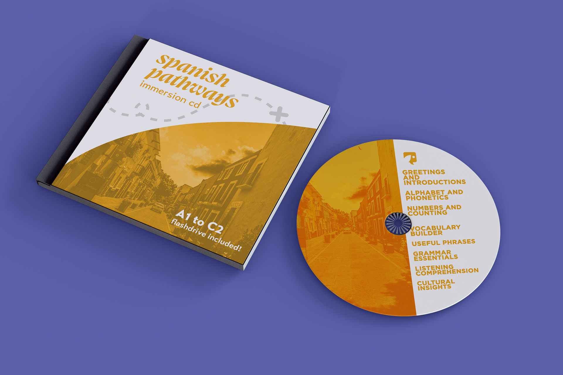
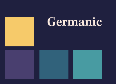
Notice a pattern? For every language family covered, I created a mini brand system with a corresponding color palette and typography that would fit that language best.


And finally, what's a brand package without patterns?

